CASE STUDY
WEBSITE REFRESH
FOUNDATION
Client
Vera Ruttkowski is not “just” a virtual assistant—she’s also the founder of Fernarbeit.net, a vibrant portal that helps aspiring virtual assistants build thriving businesses while working remotely.
Brief
After years of successfully running her own VA business and helping others do the same, Vera felt it was time to breathe new life into her website.
Her existing WordPress site had served her well but needed a refresh to reflect her evolving business.
She came to me with a clear goal: to give the site a makeover that not only looked more modern and appealing but also worked harder for her by creating a seamless experience for potential clients.
Armed with an updated copy she had written herself, Vera and I embarked on a short but impactful journey to elevate her online presence.
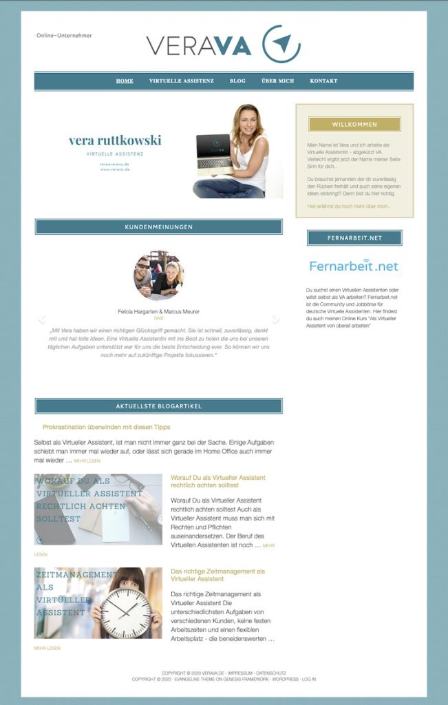
The "before"
Before the refresh, Vera’s website had all the essential information but felt a bit plain and out of sync with her evolving business. It was functional but could benefit from a more polished, professional look that truly captured her expertise and appealed to her ideal clients. Moreover, the original website was overloaded with many pages and a blog that made it somewhat complicated to navigate. This clutter detracted from the user experience and made it difficult for visitors to find the information they needed quickly. We saw an opportunity to give it a modern update, enhancing its visual appeal while streamlining the navigation and maintaining the informative nature that made it a helpful resource for her visitors.
OUTCOME
The transformation
In just a few days, we completely transformed Vera’s website into something that truly reflects her expertise, energy, and her personal brand.
Using her original branding, we gave the site a fresh, clean look that feels welcoming and professional—perfectly aligned with Vera’s voice. The restructured layout puts her expertise front and center, making it crystal clear to visitors why she’s the go-to person for all things virtual assistant-related.
One of the most impactful changes was integrating a scheduling system, which now works like a charm to automatically book consultations without any back-and-forth. This system has become a key feature of the site, allowing her potential clients to easily book their free consultations, turning interest into action. With this streamlined setup, Vera’s inquiry process now runs smoothly on autopilot, freeing her up to focus on what she does best.
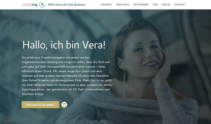
A warm welcome that *pops*
This hero section is all about making an unforgettable first impression! With a clean, modern vibe and a friendly photo of Vera, it instantly connects with visitors, speaking directly to them. The polished branding balances professionalism with approachability, setting the stage for why Vera’s the go-to virtual assistant—making visitors feel at home from the very first scroll.
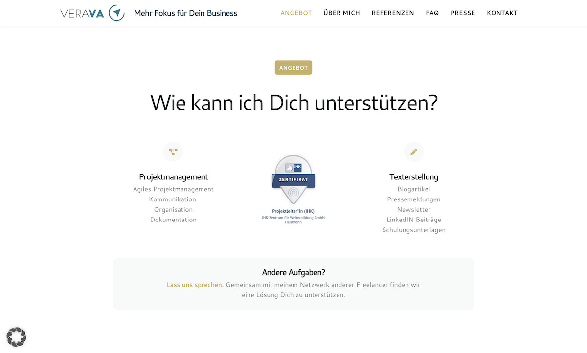
Showcasing Vera’s expertise with confidence
This section puts Vera’s services front and center, making it super easy for visitors to see all she brings to the table. Backed by her latest certification, it’s not just a list—it’s a snapshot of her skills and dedication. This clear, professional layout builds trust and positions her as the skilled, certified pro clients are looking for.
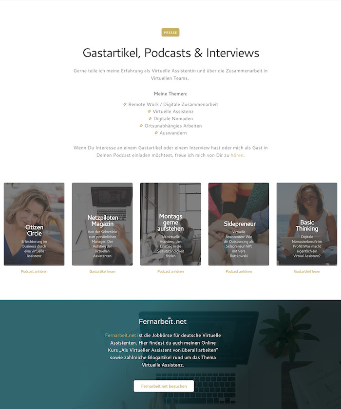
Double impact: media mentions & Fernarbeit.de
Two sections, one powerful message! First, we showcase Vera’s media mentions—like podcast appearances—boosting her credibility as a go-to expert in remote work. Right below, we introduce Fernarbeit.net, the platform she founded with passion and purpose. Together, these sections tell her story, positioning Vera as a leader and advocate for the remote work movement.
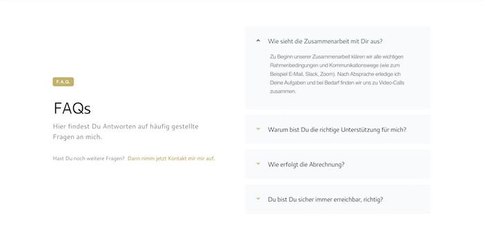
FAQs: clearing up questions & saving time
This FAQ section is all about making life easier for both Vera and her clients! By addressing common questions upfront, visitors get quick answers, minimizing back-and-forth and freeing up Vera’s time. It’s a simple addition that adds huge value, ensuring everyone gets the info they need, hassle-free.
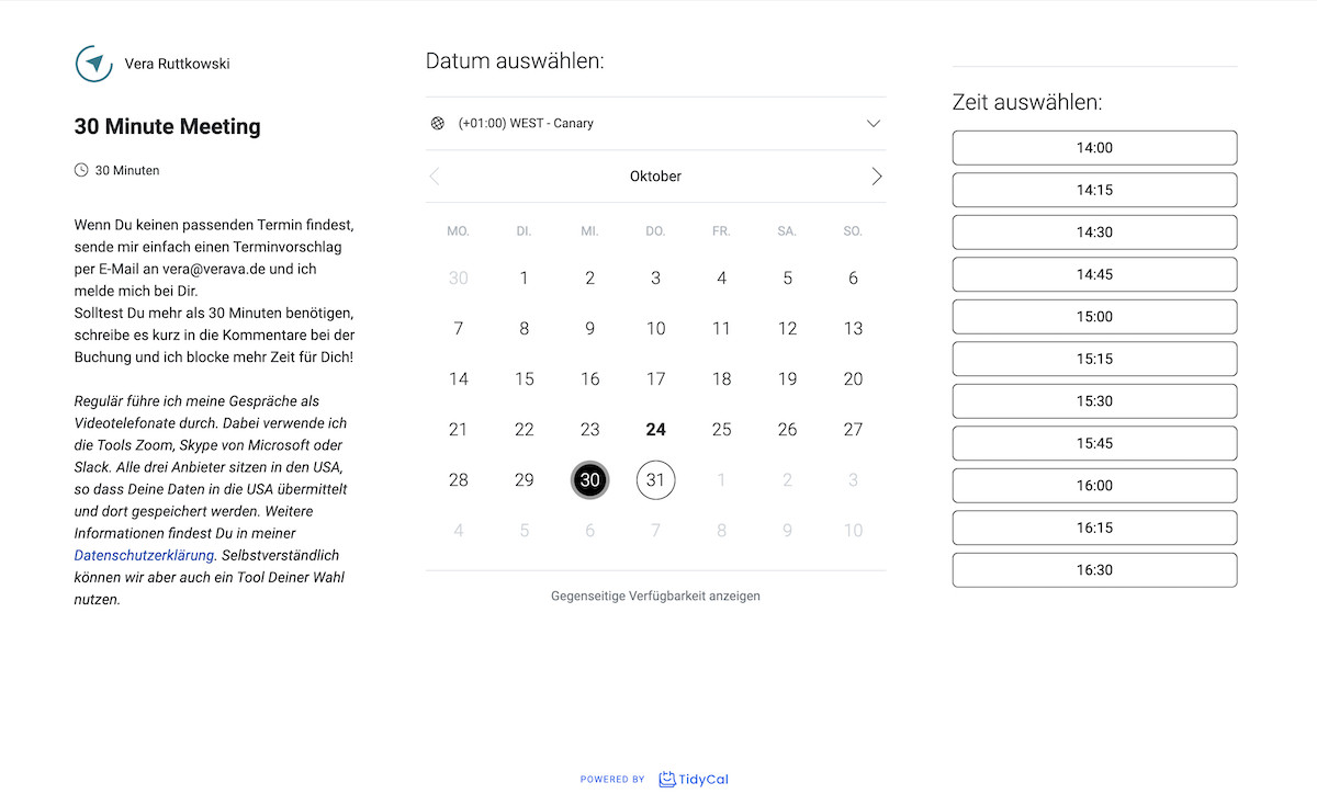
And finally... an appoinment scheduler to streamline bookings!
This embedded appointment scheduler is a game-changer! Clients can effortlessly book time in Vera’s calendar, eliminating the back-and-forth emails. This seamless integration not only saves Vera precious time but also makes it super easy for potential clients to take action. It’s all about turning interest into consultations, helping Vera focus on what she does best while the inquiries flow in smoothly!
RESULT
TESTIMONIAL
Here's what Vera said:
“I could not be more happy with the website Veronika created for me. I only had a rough idea on what I wanted and Veronika made right on point suggestions. She also had the great idea of integrating an appointment booking tool and I already got several bookings from that. What I most appreciate is, that I did not have to deal with any technical issues as she set-up everything and had helpful tips for plugins and tools. The website was ready much faster than I expected and I keep receiving very positive feedback about it.”
Ready to elevate your brand online?
Explore how my holistic web design approach can authentically showcase your brand and resonate with your audience. Let's collaborate to create a website that not only looks stunning but also drives meaningful connections and business growth.

