Silvia García Pérez
Dedicated Reiki therapist and life coach. Through her practice, Silvia helps individuals achieve personal growth and balance.
CASE STUDY
WEB DESIGN & SEO
FOUNDATION
The client
Silvia’s journey with Reiki began in 2006 and culminated in mastery by 2011, driven by personal experiences and life changes. Silvia integrates Reiki and coaching to create powerful, transformative sessions. She’s committed to the synergy of these practices, reflecting her holistic approach in every aspect of her work.
Project goals
Silvia has been practicing Reiki for almost 20 years but hasn’t yet established an online presence to effectively showcase her expertise and attract a broader audience. She was ready for a website that:
- Truly represents her brand and the business she has developed over the years
- Allows her to manage bookings efficiently and effortlessly
- Is easy to update as her business evolves
- Draws in new clients whose values resonate with hers
- Provides detailed information about her services, including Reiki sessions, coaching, and courses
- Showcases testimonials and client stories to build trust and credibility
- Offers educational resources about Reiki and coaching
- Facilitates communication through contact forms and newsletter sign-ups
The new website will not only enhance her online presence but also streamline her operations, making it easier for clients to connect with her and benefit from her services.
The "before"
Prior to our collaboration, Silvia’s business operated without a dedicated website, relying instead on traditional word-of-mouth referrals, social media presence and local marketing efforts to attract clientele. While effective on a small scale, these methods constrained her ability to expand her reach beyond her immediate community. Recognizing the growing importance of an online presence, especially since Silvia offers both online services and in-person courses, we identified the need for a comprehensive website.
BRANDING
Logo & brand mark
The client provided the logo and brand mark, and we kept it just as it was. This gave us a great starting point to build a richer and more detailed visual brand.
Color scheme
I developed a soothing yet dynamic color palette to reflect Silvia’s warm-hearted energy.
Building on Silvia’s existing logo, I expanded the color scheme by incorporating pastel tones and a contrasting green. The combination of shades of red, pink, and green enhances Silvia’s warm, loving, and positive personality.
Fonts
To create a soft, feminine look that matches Silvia’s caring attitude, I chose Noto Serif for headings and Poppins for body text, which closely resembles the premium font used in the logo.
Stock photography
After identifying Silvia’s brand personality as supportive and warm-hearted, I used this insight to guide the selection of stock photos. I curated a collection that aligns seamlessly with Silvia’s values and resonates with her audience. The chosen photographs not only accurately reflect her target demographic but also complement the personal photos Silvia provided, creating a cohesive visual narrative.
Integrating Reiki chakra symbolism
A key element of the project was incorporating the symbolism of Reiki chakras, which are traditionally depicted as circles. This motif was already present in Silvia’s logo, and I decided to extend it throughout the website design. By using rounded icons in the brand colors, I reinforced the connection to Reiki and ensured a cohesive visual theme. This thoughtful integration not only highlights Silvia’s holistic approach but also creates a harmonious and inviting user experience.
RESULT
The website
I combined the colors, fonts, logos, stock photos, and copy provided by the client to create a website that guides Silvia’s clients smoothly through their journey.
I designed a clear path from learning about Silvia and her offerings to booking a session with her. This ensures that the website attracts only the right clients for her Reiki or coaching sessions.
The completed website includes:
- Six Core Pages: Home, About, three services pages (Reiki + Coaching, Coaching, Reiki Courses), and Contact.
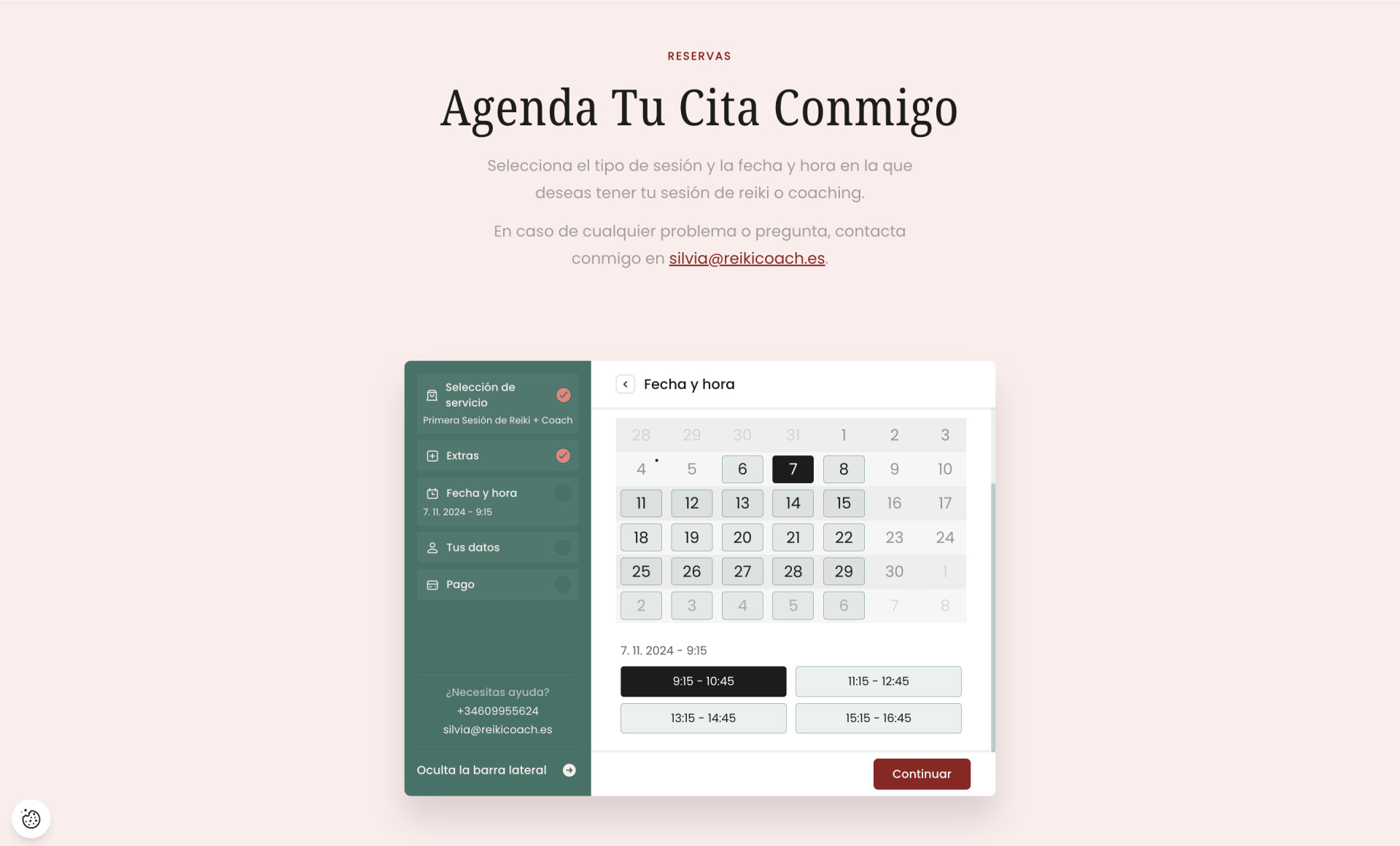
- Session-Booking Page: Featuring robust booking software that simplifies Silvia's scheduling and automates much of the associated administrative tasks.
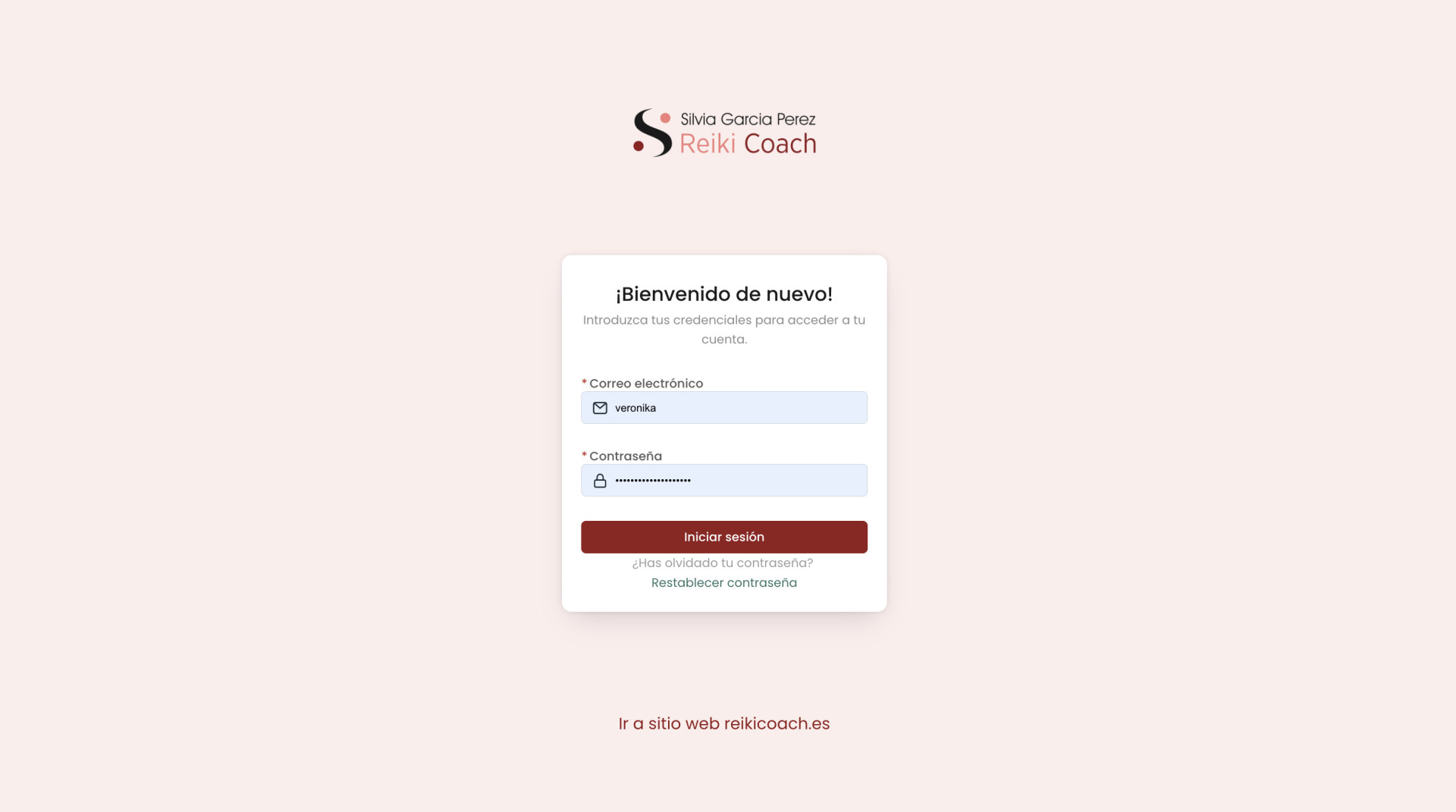
- Client Portal: Allows Silvia's clients to manage their bookings independently.
- Waitlist: For Silvia's upcoming offers.
- Blog Section: Ready for use!

A warm welcome to Silvia’s world
The homepage is designed to feel like an open invitation into Silvia’s world, giving visitors a clear, friendly introduction to who she is and what she offers. From her story and services to her blog and educational resources, this page provides a holistic overview that guides visitors effortlessly toward the support they’re seeking—whether it’s Reiki, coaching, or both.
Effortless booking for a seamless experience
The session booking page takes the hassle out of scheduling! With an easy-to-use system, clients can book their sessions at a time that suits them without any back-and-forth. This page streamlines the process, allowing Silvia to focus on her clients while they enjoy a smooth, stress-free booking experience.
Client portal: personalized & empowering access
Silvia’s client portal is all about convenience and empowerment. Returning clients can log in to easily manage their sessions—whether booking a new one or adjusting an existing reservation. It’s a dedicated space that offers Silvia’s clients full control, making it simple to stay connected and engaged with their wellness journey.
TRANSFORMATION
The impact & results
To achieve the project goals, I focused on a cohesive design strategy that integrated all elements of Silvia’s brand. This included:
- Curating a consistent visual style using colors, fonts, and imagery that reflect Silvia's personality.
- Designing a user-friendly navigation path that guides visitors from discovery to booking.
- Implementing a robust booking system and a client portal to streamline Silvia's administrative tasks.
By achieving these goals, we created a website that not only looks great but also functions smoothly.
The user-friendly design helps potential clients easily understand Silvia's services and book sessions, while the administrative tools free up Silvia's time, allowing her to focus more on her clients.
Although the website was launched just last week, it has the potential to significantly improve client engagement and streamline Silvia’s business processes. I look forward to gathering more detailed feedback and measurable results in the coming weeks and months!
Ready to elevate your brand online?
Explore how my holistic web design approach can authentically showcase your brand and resonate with your audience. Let's collaborate to create a website that not only looks stunning but also drives meaningful connections and business growth.


